Style Over Substance
Just for fun, here are some of my (least) favorite random examples of style over substance and its opposite. This all feeds into my recent blab about the importance of good writing. Maybe you disagree with my theory or picks, so flame away in the comments section if you are so inclined! Onward!
Style Over Substance
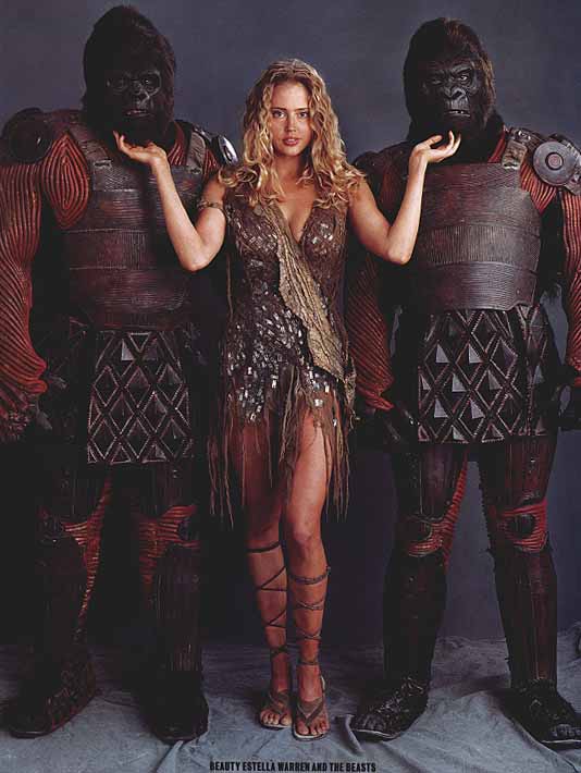
The films of Tim Burton: I will say that one of my favorite movies of all time is Pee-Wee's Big Adventure and Edward Scissorhands is great, but otherwise Burton is a brilliant visualist, but a horrid filmic storyteller. The Batman films were stodgy and flat. Mars Attacks looked pretty, but you didn't care about who lived or died. And don't get me started about Planet of the Apes! Somewhere, a tear rolls down the face of Charlton Heston.

Heavy Metal: Amazingly terrible terrible animated film. One of the worst piles of crap ever put to celluloid. Somehow the brilliant cartoonist Moebius got attached to this turd and wasn't able to save it. Some of the designs were nice, but that's about it. The stories are idiotic, the characters unsympathetic- an excuse for pointless animated toilet humor, Frazetta ripoff imagery, and topless chicks. Ug.
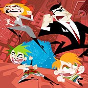
The majority of what's on the Cartoon Network, Nickelodeon, etc.: We have entered the age of super designy, super flat, 50's retro cartoons. Sadly, most of them suck. And the designs are so fancy that it becomes unclear what you are looking at, which is death to a cartoon. If there's one thing I've learned, is that if the audience gets confused or are overwhelmed, they will tune out (no pun intended). And I don't know about you, but they are all starting to blend together for me. Boring!

Most Superhero Comics since forever: If it were a contest to see who would get the most lines on a page, these comics would surely win. But, where is the soul? Do we really care about what happens to these characters? Can you even name half of them? The monumental thing that Stan Lee and Jack Kirby did back in the day was to give superheroes a human face. Sad that we lost it along the way.

Most recent R&B music: Similar to the superhero comic example, if it were a contest to see how many wide ranging notes one singer could hit in a 5 second time frame, these modern "singers" would win hands down. But, its not and they suck. Since when does every single line or phrase in a song need to be embellished so much? Can anyone hold a single note anymore? And anything that helped to spawn the karaoke hell that is American Idol must die. (if you can't play an instrument or never wrote a song, you are not a musical artist, period!)
Substance Over Style

South Park: Looks like crap in a homespun funny way. Crude looking characters and backgrounds, even cruder animation. But, oh shit is it funny and daring, and amazingly consistently so after a million seasons. Up there with The Simpsons, Spongebob Squarepants and Rocky and Bullwinkle as one of the greatest animated TV shows ever.

Rocky and Bullwinkle: Speaking of which, another classic example of a minimally animated, quickly scrawled show. But, the writing was so witty and sharp, kids of all ages enjoyed it and still do. You see, if your writing is strong enough, it can look like shit and no one cares!
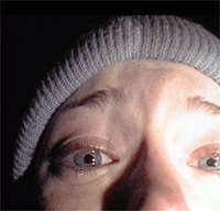
The Blair Witch Project: OK, so its not one of my favorite films of all time. But it is a perfect example of what you can do with a great idea, verite acting and clever editing, despite having been entirely filmed on crummy home video cameras. The movie is damn scary and freaked me out but good. Come to think of it, the horror genre actually is one of the few to exploit crappy or homespun technique to good effect- there is something profoundly scary about the beat up, desaturated, scratchy look of films like Last House On The Left or Texas Chainsaw Massacre.
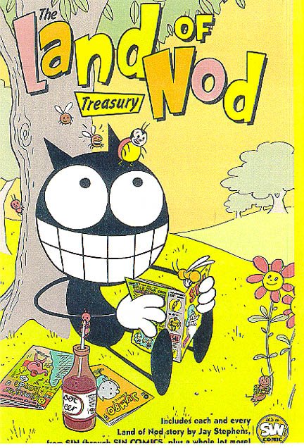
Land Of Nod: This comic book by Jay Stephens cracked my ass up! And part of its charm was the stick figure drawing style- pure minimalism, pure goodness. Seek this out! (Is it a coincidence that the majority of minimalist cartoons or comics are comedic in nature?)
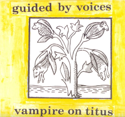
The early music Of Guided By Voices: Lo-fi trash, indeed! More static and crackle than you can shake a dick at. Enough so to turn off most slick pop music zombies for good (I was almost one of them). But upon careful repeat listening, the amazing and melodious songwriting hooks you in. And the ear-splitting DYI spontaneous one-take aesthetic gives the music a real raw edge so sorely lacking in this smooth digital age. RAWK!
I'm not saying that all things that are well produced, well drawn or fancy are bad, so don't go crazy. I appreciate beautiful plastic as much as the next guy. It's just that, especially in storytelling mediums, without a good narrative structure you are in deep doo-doo. And the visuals are way less important. Seacrest out!
posted by Phil at 10:13 AM
![]()
![]()


0 Comments:
Post a Comment
<< Home